Ok. This was also quite a while back. My bad!
A few days before I left for Melbourne, I had dinner in Regent Hotel (to celebrate mum's professor's birthday). Posh restaurant, lots of photo opportunities, but the best photo opportunites are, of course, illustrated in the pictures I've posted. It was pretty interesting to see how the inside of the Regent changes at night - from beautiful glowing yellow, to a dark and more romantic, atmospheric colour.
I also noticed that the interior of the Regent was quite similar to Pan Pacific Hotel. Here's a picture of the interior of the Pan Pacific for comparison:

Now...moving on to the Regent. Because I went at around 6pm or so, I got to see how the Regent looked when the sky was still bright, and when the sky was dark.
When the sky was bright (around 6pm or so).....
The walkways were lined with lights, framed by glass, and of course, were long. And when I first went up, there were 2 children playing around that area. So here they are, standing at the intersection of 2 walkways. I also love how the glass reflects the light, making it seem really abstract.
Glass chandelier in the lift lobby. It looks pretty daunting...imagine how much glass was used to make this magnificent thingy...
The lobby was pretty fanciful though. And somehow it reminded me (again!) of Pan Pacific!
And the interior of the Regent. Well - here's one difference. In the Pan Pacific, all the lifts were lined to one side, parallel to each other. While in the Regent, all the lifts were right in the middle, supported by a giant pillar right in the middle of the building, with walkways extending from all 4 corners.
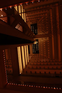
But here's the similarity between the Regent and the Pan Pacific. The rooms and their respective corridors were all visible to us. The rooms are actually built around this massive foyer - whoever looks down from the open corridors can see what's below. And of course, the ceiling is transparent. This is similar to what the Pan Pacific offers.
Oh yes, the lights lining the walkways.
And another view of the floors housing the guest rooms. Every now and then a guest would be on the walkway, and would take the lift down. And I was pretty fascinated by the bubble lifts - they're actually really fun to ride!
The main area where I mostly stayed around - which housed the restaurant, the foyer (of course), the cafe, and a grand piano (which would be shown later).
So yeah, we had our hunger satisfactions and by the time we finished, it was dark outside.
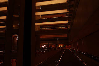
And the Regent took on a darker side. Same architecture, same intensity of lighting, but the natural light from the ceiling can really cause drastic changes like this!
Symmetry - gosh I really had to standby and wait for the right moment, just for the 2 lifts to be exactly level!
Someone taking the lift upwards - presumably to the guest rooms.
The same walkway which I took 4 photos back. Minus the lift, and with a similar angle.
Spiral staircase - in case the lifts do not work, or in case we feel like taking the stairs instead.
Oh yes, and here's the main entrance. Posh and beautiful!
And the ground floor, where the grand piano was. To be honest, I was so tempted to play on it. But unfortunately, this is a high-class hotel, and I'd probably be kicked out if I did play on it.
Trying to get an overhead shot of the entire building...quite successful, actually :)
And before I left, I took various shots of the famous fountain outside the Regent. Deliberately slowed the shutter speed even further, and switched to manual mode to make the water seem like lines.
And by then, the alcohol was starting to take its toll on us, so we had to leave.
Ok, we're nearly done with the places I went to in Singapore, I guess. Maybe one or 2 more places before I can officially call it a day and switch back to Melbourne mode? I'll dig out my photo collection and check it out. Till then, adios!


